Make a Movie Poster in Photoshop
Like a trailer, a movie poster can capture your audience’s attention and spark their interest in your film. It has to be concise, inviting the audience to dive further into the story.
Dos and Don’ts
Don’t: Make a mess.
A good movie poster should be clear and intriguing. The number of objects and overall composition on the canvas should be focused to instantaneously give the audience an idea of the movie. Prevent yourself from having too many focal points in the poster, which will just make your poster look clustered and frustrating. Here are a few examples:
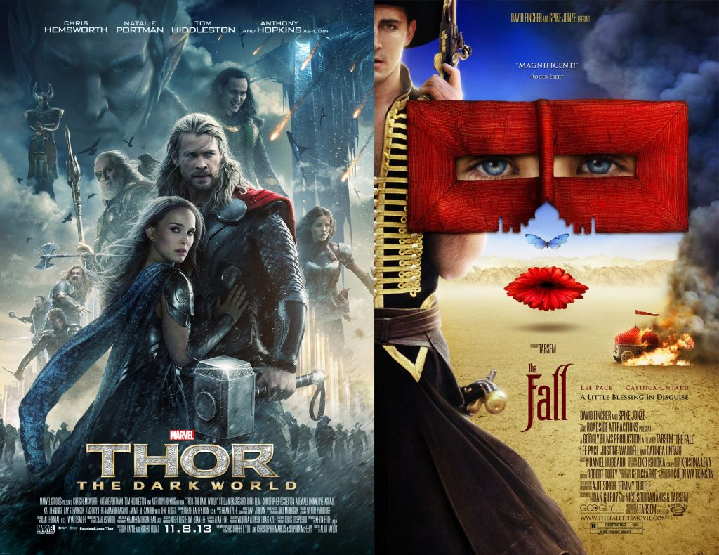
From an artistic point of view, both posters have very elaborate editing. However, if an audience doesn’t have background knowledge about these movies, they will not be able to tell what’s going on.
Do: Keep it simple. Less is more.
A great movie poster doesn’t always need to have fancy Photoshop editing. Sometimes, all you need is a hook. An image that suggests the promise of the plot, or just mainly a shot of what you think is the best moment of the film to lure them into the theatre. Here are some examples:
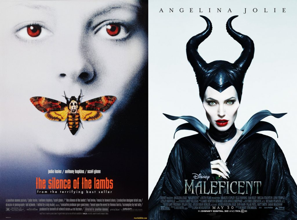
So what makes a good hook?
An appealing image. One simple focused shot of the main subject or conflict of the film to tease the audience.
Using Photoshop to Create a Great Movie Poster
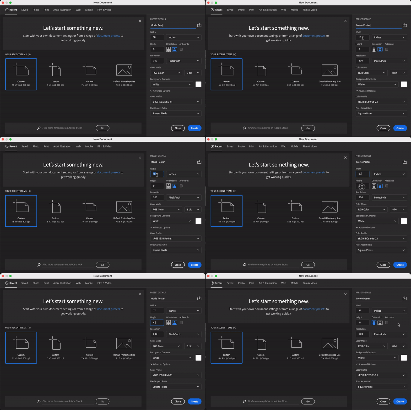
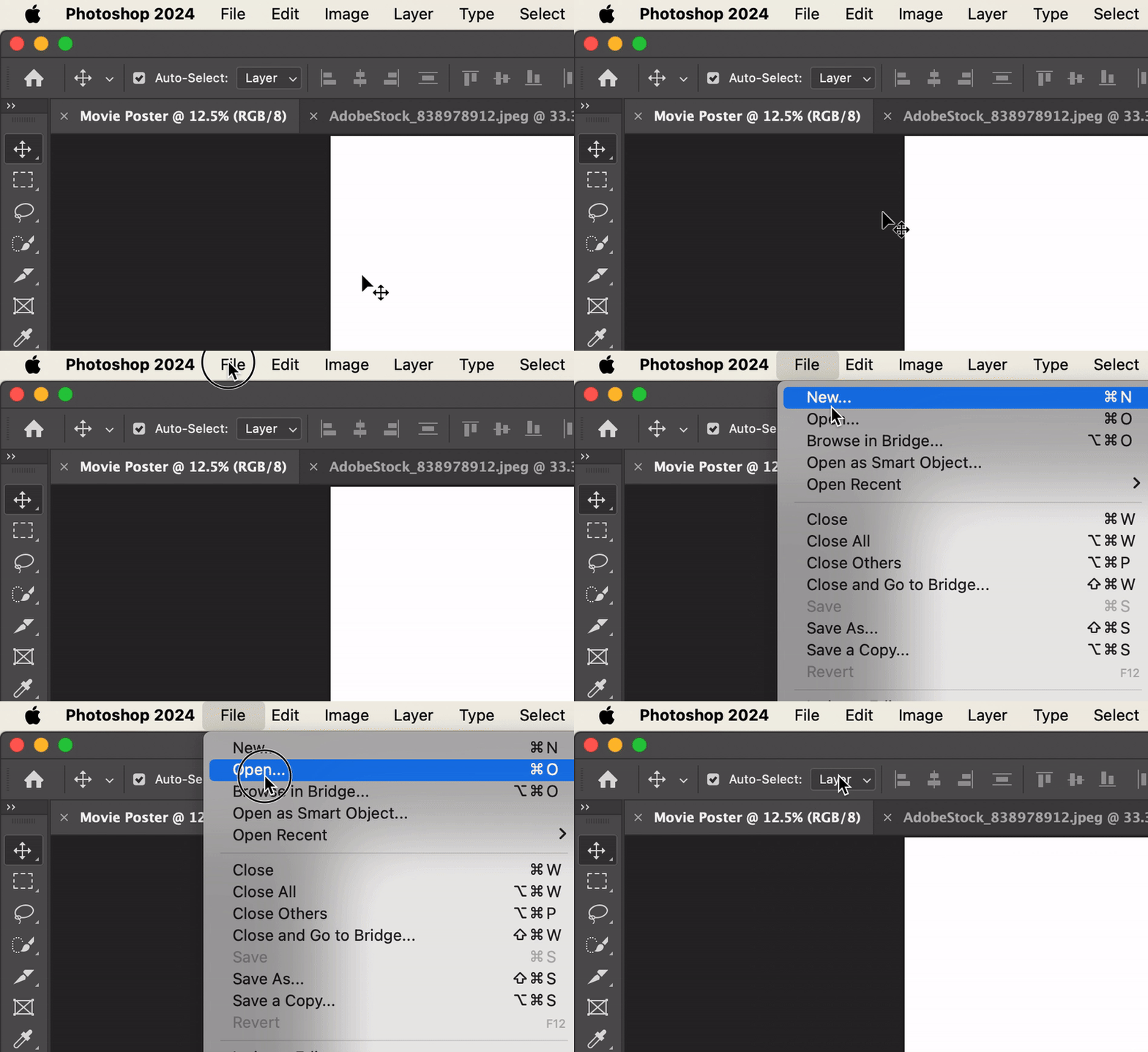
Pull up Adobe Photoshop on your computer. Click File (top left corner) > New to open up the New Canvas Window. The standardized size for a movie poster is 27″ X 41″, and make sure the units are in inches. You also want your movie poster to look crisp, so don’t forget to make sure the “Resolution” box has a reasonable value. Keep in mind that the higher the resolution, the more work your computer will have to do. Be sure that your orientation is set to portrait mode as well.
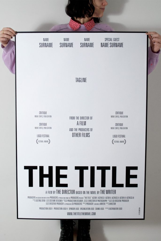
To make your poster resemble Hollywood-style posters more, you can use the standardized movie poster layout published by the New York Film Academy as a reference. You don’t have to always have all the information listed on the layout, but it also helps to check if you’re missing any important information when you’re near completion.
Retouching the Main Image
Click File > Open to import your image. Your image should capture what you think is the main focus of the film and that will make people intrigued in your work.
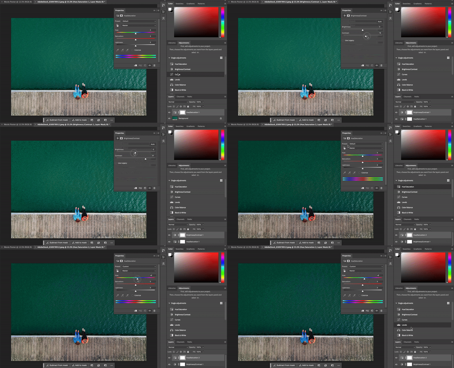
Most movie posters tend to show conflicts to capture the audience’s curiosity. If this is not your intention, it’s also good to know how to enhance your image to make it look more official–even if it’s been taken through a phone camera. The secret words here are vibrancy and contrast (take another look at the examples above). To enhance or dramatize your photo, feel free to play with the tools in the “Adjustment” section to add filters to your image and see the difference.
If you don’t see the Adjustments panel, click Window > Adjustment to turn the panel on.
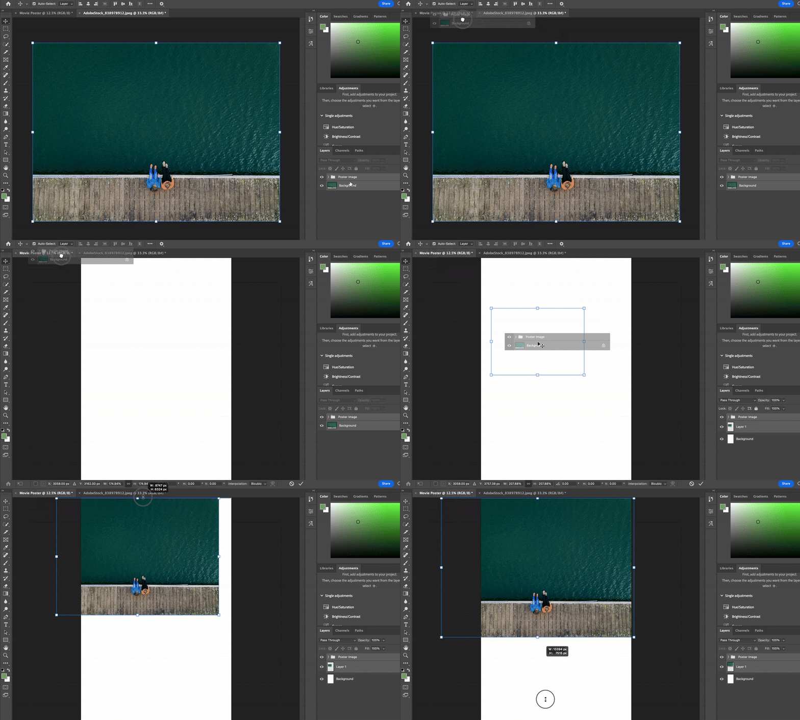
Once you’re happy with how your image looks, select all the layers in the file, right-click (Windows) or Control + Click (Mac), then select “New Group” to combine all the filters into one group.
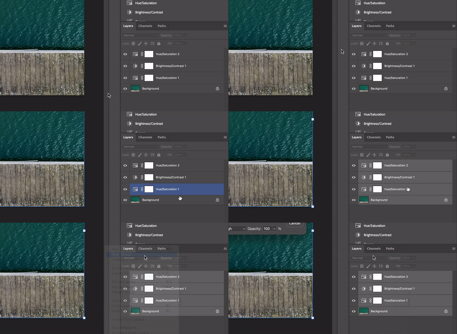
This helps when you want to go back and edit the filters to your image in the future. Import the new group to your Poster canvas for the next step by dragging it into the Movie Poster panel near the top of the screen, and resize your photo if need be.
Poster Text
You should have your image filling the entire canvas or do your best to blend the image with the background color. Then, use the Type tool on the toolbar to the left of the screen to create your text box.
The Poster Font
Ever wonder what font all modern movie posters use for their credits section? You can get it here or you can mimic it by narrowing the width and spacing between letters on several Sans Serif fonts.
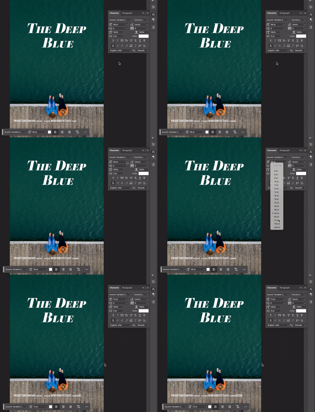
Once you fill in all of your information about your cast and crew, you’ll have your finished movie poster!
Want more Photoshop tutorials? Take a look here!


